This golden ratio stuff might sound a little odd at first. We’re aware that comparing website design to the creation of the pyramids, or the pattern of the seeds of a sunflower is going to sound like lunacy, but bear with us okay?
Basically, the golden ratio (also called the divine proportion) is a common mathematical ratio that is found in nature and can be used to create designs that are perfectly balanced and pleasing to the eye.
The ratio is based on the Fibonacci Sequence – which you might remember from your high school maths class – or for those not paying attention that day – Dan Brown’s ‘The DaVinci Code’. Those numbers follow a 1:1.618 ratio – aka the golden ratio.
It’s difficult to explain in just a few words but if you’re interested in finding out more you can watch this short TED Talk:
The Golden Ratio appears in all sorts of weird places in nature and throughout human history including:
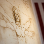
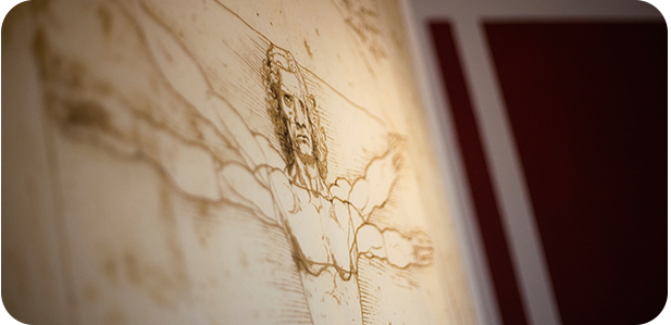
- Leonardo da Vinci’s ‘The Last Supper’
- Pineapples
- The seeds in a sunflower
- Honeycomb
- Flowers
- Spiral galaxies
- Hurricanes
- The design of the pyramids
- The human uterus
- The body of an ant
- Faces
- DNA molecules
- Pinecones
- Ocean waves
- Ancient Greek architecture
- The Mona Lisa
- Junji Ito’s “Uzumaki”
Strange – but true!
So these days – designers are incorporating the theory of the golden ratio into their designs to enhance their effectiveness. For example, in 2010 the Twitter redesign was based on the golden ratio and more recently, the Apple iCloud logo was created using the 1:1.618 ratio.
So how can you incorporate the Golden Ratio into your website design?
Using the golden ratio in web design is quite easy. For example – to figure out the width of your main content vs. your sidebar columns – you would take the total width of your content area (let’s say it’s 900px) and divide that by 1.62 to get 555.55px. You don’t need the measurement to be super exact so you can round it down to 555px to make it easier. Now, your main content element will be 555px wide and your sidebar will be 345px! Easy!
Too much maths? Try the rule of thirds …
If (like us) you’re not a mathematical genius, then you can incorporate the theory of the golden ratio into your design by using a simplified version of the ratio called the rule of thirds. Dividing your design into thirds is a really simple way of applying the divine proportion without having to get out your calculator each time.
This means (according to the rule of thirds) that every design can be easily divided into nine equal parts. All you have to do is add two equally spaced vertical lines into your design, followed by two equally spaced horizontal lines – just like the lines you see when looking through the viewfinder on your camera.
Now that you’ve sectioned your design area, you can start focusing on the strongest area of the design which is the top left corner. Since users scan websites according to an F shape you can then branch out horizontally and vertically from that point, using the ‘rule of thirds’ grid as your guide.
Why use the divine proportion?
It’s not compulsory of course – and designs that don’t incorporate the golden ratio can also be effective, but using the ratio in your designs can help you create a balanced design that communicates effectively, is pleasing to the eye and has a comforting effect on your audience.
For more information about the golden ratio, or about web design in general, contact the team at 121 Creative today!